

New Visual Identity Honors Our Past and Carries Us into the Future
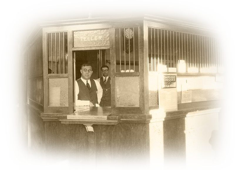
On June 10th, the 116th anniversary of New Market Bank, my father (Bob Vogel), my sister (Karen Ramola), several other family and team members and I had the privilege of unveiling a new visual identity for the bank – a new logo that honors our past and will carry us into the future.
It had been some time since our logo was freshened up, so it was time. Following recent strategic planning sessions, we identified the logo as one way we could further communicate who we are. The resulting logo captures well the bank’s vision and history of providing “banking as easy and sincere as a handshake.”
Our marketing team worked with Twin Cities design agency Mercury Creative Group on the logo development. Carl Sandusky, senior designer with Mercury, said “We sought to design a new logo mark representing the value the bank puts on service and its relationships with customers. We carefully considered how to represent this visually, both with the icon, in its display of interlocked hands, and the approachable, yet legible, typeface. A mix of bold and neutral colors were employed to bring in a sense of warmth, security and timelessness.”
While our industry is experiencing a lot of mergers, acquisitions and even some bank closures, my family remains committed to being a local, family-owned community bank well into the future. We know the relationships we have had for generations with our customers have brought us this far, and even in this digital age, strong relationships will carry us into the future. The new logo will serve as a daily reminder of the importance of those relationships to our business, our communities and our lives.
Yes, New Market Bank may look a little different on the outside now but our ownership, and our commitment to customers and our communities remain the same.